Creating Heat Maps
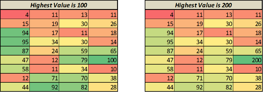
A heat map is nothing but a visual representation of data where color changes based on the value. For example, you can create a heat map where a cell with highest value is colored green and there is a shift towards red color as the value decreases.
Something as shown below

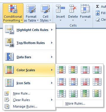
To create this, go to Home –> Conditional Formatting –> Color Scales, and choose one of the color schemes

Note: Similarly, you can also insert data bars or Icon sets
source; ExcelTrump
You received this message because you are subscribed to the Google Groups "Keep_Mailing" group.
To unsubscribe from this group and stop receiving emails from it, send an email to keep_mailing+unsubscribe@googlegroups.com.
To post to this group, send email to keep_mailing@googlegroups.com.
For more options, visit https://groups.google.com/groups/opt_out.
No comments:
Post a Comment