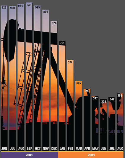
T ony sends this chart and asks if it can be done in Excel. It sounded like a good challenge for a lazy Sunday morning. So here we go. (Posting it on Monday).
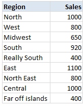
Now I could not get an oil rig photo or that data. So I made up few numbers and used a photo of Flinders street station I took when I was in Melbourne last year. Step 1: Arrange the data.Arrange the data like this.
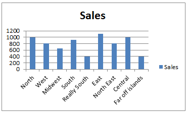
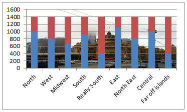
Step 2: Create a column chart Select the data, insert a stacked column chart (why not a regular column chart?, you will understand in a minute). You will get this.
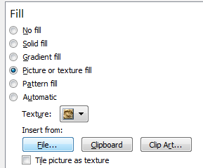
Step 3: Set up image as background for chart's plot areaSelect chart's plot area. Press CTRL+1. Choose picture or texture fill and select the file with image you want.
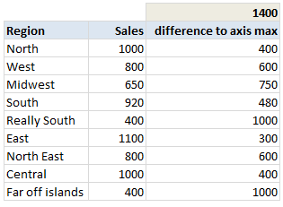
Step 4: Add dummy max-seriesIn your data, add a column which gives the difference between column values & axis maximum. For our test data, I choose 1,400 as axis maximum, so the dummy series values are,
Now add this series to chart. Step 5: Format the chartNow, we are almost done. Our chart looks like below. We just need to format it.
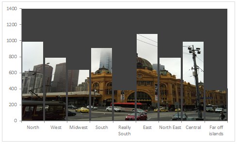
Your column chart with background image is ready!
Note of caution: Go easy with imagesThe main purpose of a chart is to convey information. By adding a background images, sometimes your chart will be difficult to read. So I suggest you to go easy with background images. Download Excel workbook with this chartClick here to download Excel file with this chart and play with it. Examine the chart formatting settings to understand this technique better. |
You received this message because you are subscribed to the Google Groups "Keep_Mailing" group.
To unsubscribe from this group and stop receiving emails from it, send an email to keep_mailing+unsubscribe@googlegroups.com.
To post to this group, send email to keep_mailing@googlegroups.com.
Visit this group at http://groups.google.com/group/keep_mailing?hl=en-US.
For more options, visit https://groups.google.com/groups/opt_out.
No comments:
Post a Comment